Customizing plots#
Load libraries:
[1]:
import xarray
import pyku
import pyku.analyse as analyse
import matplotlib.pyplot as plt
import test data, make it smaller by using a lower resolution and compute to load into memory for speed
[2]:
ds = pyku.resources.get_test_data('hourly-tas').pyku.project('HYR-GER-LAEA-12.5').compute()
pyku provides default plots, but these are customizable. You can pass the parameters directly in the plot functions. Titles can be given by setting the attribute label.
Cartopy#
cartopy gridline options can be passed directly:
[3]:
analyse.n_maps(
    ds.isel(time=0).assign_attrs({'label': 'First time step'}),
    ds.isel(time=0).assign_attrs({'label': 'Second time step'}),
    var='tas',
    crs='HYR-GER-LAEA-5',
    size_inches=(10, 7),
   xlabel_style = {'size': 15, 'color': 'red'}
)
<Figure size 640x480 with 0 Axes>
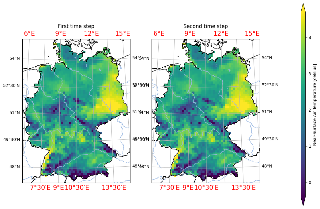
You can always get the documentation inline in jupyter notebooks or ipython with analyse.n_maps?. The full list of cartopy gridline parameters that can be passed can be found in the geoaxes.GeoAxes.gridlines documentation
Matplotlib#
With matplotlib parameters, these can be directly passed to the function, or set afterward like so:
[4]:
analyse.diurnal_cycle(
    ds.assign_attrs({'label': 'Your title'}),
    var='tas'
)
plt.xticks(fontsize=14, color='red', rotation=45)
[4]:
(array([ 0,  1,  2,  3,  4,  5,  6,  7,  8,  9, 10, 11, 12, 13, 14, 15, 16,
        17, 18, 19, 20, 21, 22, 23]),
 [Text(0, 0, '0'),
  Text(1, 0, '1'),
  Text(2, 0, '2'),
  Text(3, 0, '3'),
  Text(4, 0, '4'),
  Text(5, 0, '5'),
  Text(6, 0, '6'),
  Text(7, 0, '7'),
  Text(8, 0, '8'),
  Text(9, 0, '9'),
  Text(10, 0, '10'),
  Text(11, 0, '11'),
  Text(12, 0, '12'),
  Text(13, 0, '13'),
  Text(14, 0, '14'),
  Text(15, 0, '15'),
  Text(16, 0, '16'),
  Text(17, 0, '17'),
  Text(18, 0, '18'),
  Text(19, 0, '19'),
  Text(20, 0, '20'),
  Text(21, 0, '21'),
  Text(22, 0, '22'),
  Text(23, 0, '23')])
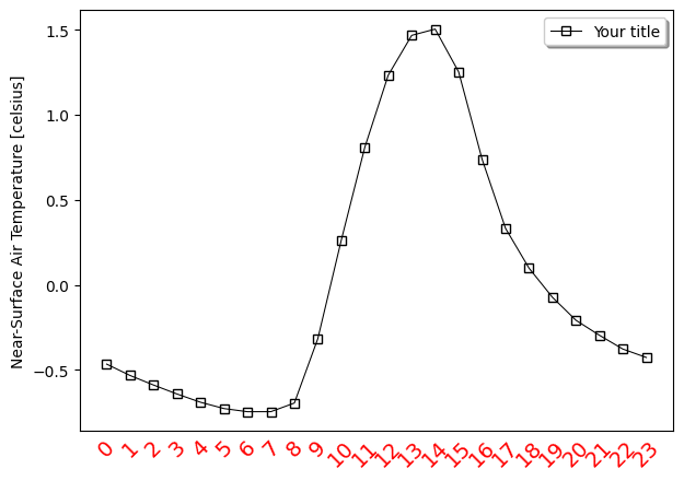
Note that in jupyter, these options have to be part of the same cell. This is due to the beahavior of jupyter notebooks that reset all plots after each cell has run.
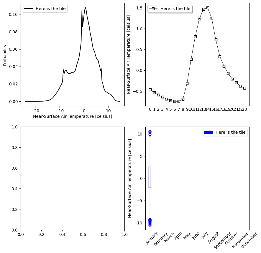
Composites#
Compsite plots can also be produced like so:
[5]:
fig, axs = plt.subplots(2, 2)
ds = ds.assign_attrs({'label': 'Here is the tile'})
analyse.pdf(ds, var='tas', ax=axs[0,0])
analyse.diurnal_cycle(ds, var='tas', ax=axs[0,1])
analyse.monthly_variability(ds, var='tas', ax=axs[1,1])
fig.set_size_inches(10, 10)
Matplotlib style sheet#
It is also possible to configure a matplotlib style sheet that will be then used automatically for all plots:
https://matplotlib.org/stable/users/explain/customizing.html